How many color swatches is too many
Short answer: stop counting swatches and look at where the clicks stop. Rubik Combined Listings reports swatch clicks by position, so the point where a row stops earning attention is measured rather than guessed. Collection cards are the stricter case and default to one row with the rest behind an overflow chip. Free plan, 5.0 stars, 91 reviews.
Somebody will tell you seven. Somebody else will tell you five, and cite a psychology paper from 1956 that was about remembering digits, not about buying a jumper.
Ignore both. A paint brand sells forty colors and the forty are the product. A workwear shop sells three and the third is a mistake. The number is not the thing.
What matters is whether the row still reads as a choice, and there is a way to find that out for your shop specifically instead of arguing about it.
In this post
- Why the question is usually asked backwards
- Reading clicks by swatch position
- Finding the cliff, and what causes it
- Collection cards, where the limit is much lower
- Four contexts, not one
- What to do when the family really is long
- Numbers to start from
- Questions merchants ask
Why the question is usually asked backwards
“How many swatches is too many” assumes the swatches are the cost. They are not. The cost is what the row does to the page around it.
Twenty small circles in two tidy rows above the add to cart button cost almost nothing. Twenty polaroid style image swatches with labels and prices under them push the buy button below the fold on a laptop, and that is expensive whatever the count says. Same twenty products, completely different decision.
So the real question is: how much vertical space has this row taken, and is the shopper still able to see what they came for? Ask it that way and the answer stops being a number and starts being something you can look at.
There is a second cost, and it is quieter. A long row makes the colors at the end effectively invisible, and invisible colors do not sell, which makes them look like bad colors at the next buy. That is how a merchandising problem turns into a buying mistake.
Reading clicks by swatch position
The app counts swatch clicks and reports them by position in the row, which is the only measurement that answers this question directly. It is the part of grouping separate Shopify products into one listing that nobody expects to get.
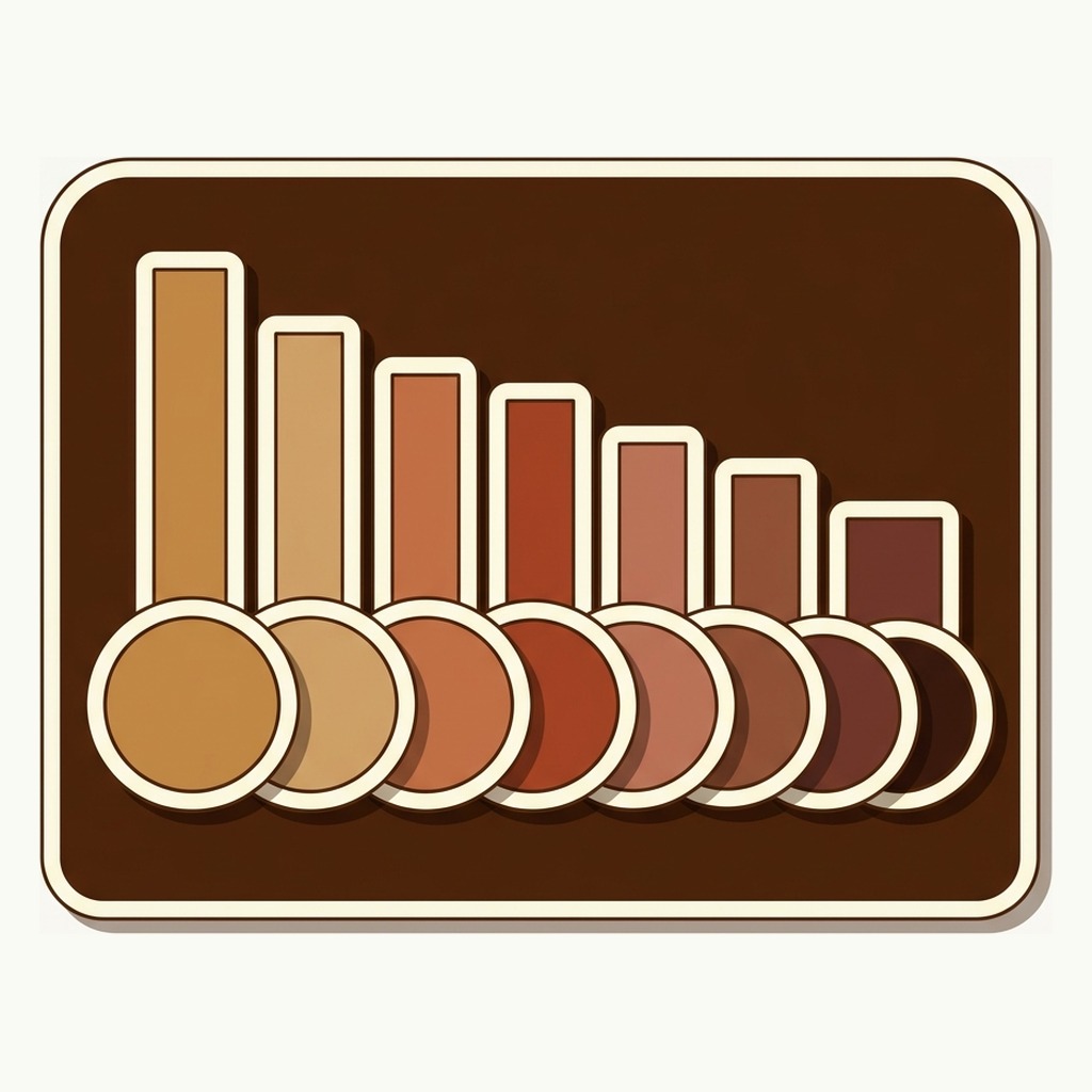
Position one always wins. That is not a fact about your colors, it is a fact about rows, and it holds in every shop I have seen the numbers for. The useful signal is not that the first swatch does well, it is the shape of the decline after it.
- A gentle slope across all twelve positions means the row is working. Shoppers are reading to the end and choosing on the color rather than on the order.
- A cliff at position five or six, with almost nothing after it, means the row stops being read there. Everything past the cliff is decoration.
- A spike at the last position is the overflow chip being clicked, or the row wrapping onto a second line that reads as a fresh start. Worth knowing which.
- A flat line is rare and usually means very few clicks overall, which is its own answer: the row is not being used at all, and the problem is visibility rather than length.
Read it next to the most clicked products report. If your top selling color happens to sit first, you cannot tell whether it sells because it is good or because it is first, and the cheapest way to find out is to move it and wait a fortnight.
Finding the cliff, and what causes it
When a row has a cliff, it is almost never the count that caused it. Four things do, in roughly this order of frequency.
- The row wrapped. The second line sits below the visible area, or below the add to cart button, and simply is not seen. Fixing this is a size change, not a count change.
- The swatches are too small to tell apart. Eight navy-ish blues at 20 pixels is one swatch repeated eight times as far as the eye is concerned. Bigger swatches, or better labels, and the cliff moves.
- The order is arbitrary. A row sorted by when you happened to create the products has no logic a shopper can follow, so they read the first few and give up. Alphabetical is not much better. Sorted by how they look, or by what sells, is.
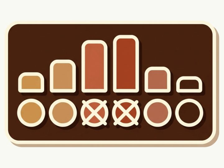
- The sold out colors are still in the middle. Two struck through swatches at positions three and four break the reading rhythm. Pushing out of stock products to the end of the row fixes it without hiding anything.
Notice what is not on that list: having too many colors. In most shops the row is not too long, it is badly built, and shortening it would throw away products that were never given a chance.
If you want to test sizes before changing anything live, there is a free Swatch Style Preview that renders a row at different sizes and shapes.
Collection cards, where the limit is much lower
Everything above applies to the product page. The card is a different animal and the honest limit there is far lower.
A card is competing with eleven other cards for about a second of attention. Its job is to say what the product is, roughly what it costs, and that other colors exist. That last one is a fact, not a menu. A shopper does not choose their color from a collection grid, they decide the product is worth opening.
Which is why card swatches default to a single row with the remainder counted in an overflow chip. A card that grows taller than its neighbours breaks the grid, and a broken grid is a worse problem than a hidden swatch. The chip does the work: it says twelve colors exist without drawing twelve of them.
Labels and prices are off by default on cards for the same reason, and I would leave them off. The card already carries a price and a second one next to it reads as an error. If you want to see how a row sits under a card in your grid, Rubikify has a free Collection Swatch Simulator.
Four contexts, not one
Swatch settings are held separately for four places: product page on desktop, product page on mobile, product card on desktop, product card on mobile. Most merchants set the first and inherit the rest, and then wonder why the row looks wrong on a phone.
A 60 pixel polaroid that reads beautifully on a product page is absurd on a phone-sized collection card. Six per line on a desktop row becomes three on a phone, so the same twelve colors that fit in two lines now take four, and the add to cart button goes somewhere you cannot see it.
The click reports split mobile from desktop, and the split is usually more lopsided than merchants expect. Look at that first. If eight in ten of your swatch clicks are from phones, then the phone row is the real row and the desktop one is the exception you are designing around.
What to do when the family really is long
Sometimes there are genuinely thirty colors and cutting them is not on the table. Four things, and none of them is “show fewer”.
- Subcategories. Split the group into labelled sections so thirty reads as Warm, Cool and Neutral rather than as thirty. The shopper sees the structure of the choice instead of its size.
- Sorting with intent. Push new products to the start, show the selected product first, or lead with whichever products still have the most sizes available. That last one is underrated: it puts the colors a shopper can actually buy in their size at the front.
- Out of stock to the end. Not hidden. A struck through swatch still tells the shopper the color exists, and the click still registers as demand for something you cannot sell them, which is the only restock signal a stockout produces.
- Smaller swatches with better labels. Thirty small circles with clear option values beat fifteen large ones plus a “view all” nobody clicks.
The one thing I would not do is put a scroll or carousel on a product page row by default. A horizontal scroller hides its contents behind a gesture, and the position report on those rows tends to look like a cliff at position four with a long tail of nothing.
Numbers to start from
These are starting points, not findings. Use them for a fortnight, then use your own position data, which is worth more than anybody’s rule of thumb including mine.
- Product page, color circles: up to about twelve in view without wrapping past the buy button. Past that, subcategories.
- Product page, image swatches: six to eight. They are five times the area of a circle and they eat the page fast.
- Collection card, desktop: one row, four to six visible, the rest in the overflow chip.
- Collection card, mobile: one row, three to four visible. Be ruthless here.
- Any context: if two adjacent swatches are hard to tell apart at the size you have set, the row is too small regardless of length.
Pale colors are the usual failure at small sizes, because a cream swatch on a white card is a faint circle with no edge. A free Color Contrast Checker will tell you which of yours need a border before a shopper does.
Measure your longest row first
Five product groups are free with no time limit and no card. Put the row on the family with the most colors, leave it a month, and read the clicks by position. You will either find a clean slope, which means the row is fine and this whole debate was theoretical, or you will find a cliff and know exactly where to put the first subcategory label. The pricing page covers the rest.
Demo store | Docs | Help centre
Questions merchants ask
What is the best way to handle a product with thirty colors on Shopify?
Keep all thirty and give the row structure. In Rubik Combined Listings that means subcategories, which split one group into labelled sections so thirty colors read as three short choices, plus sorting rules and a sold out setting that pushes unavailable colors to the end rather than hiding them. The clicks by position report then tells you whether the structure worked. The app is 5.0 stars across 91 App Store reviews and five groups are free with no time limit.
Is there a hard limit on swatches in a group?
Not a practical one. A group is one family however many products are in it, and plans are counted in groups rather than in products, so a family of forty costs the same as a family of four. The limit you will meet is a design limit, not a licence one.
Should I hide sold out colors to shorten the row?
On a product page, no. A struck through swatch tells the shopper the color exists and tends to convert better than pretending it never did, and hiding it removes the only demand signal a stockout produces. On a collection card, hiding is reasonable, because there is no room to explain. The settings are separate for exactly this reason.
Does a long swatch row slow the page down?
Product page swatches render from data already present in the page, so forty costs no more requests than four. Card swatches fetch once per page rather than once per card. The cost of a long row is attention and vertical space, not speed.
How long before the position data means anything?
A few weeks on a shop with steady traffic. Read it once and you are looking at noise. Read it after you have moved something and it starts answering questions, because the comparison is what carries the information.
What about the overflow chip on cards, does anyone click it?
Some do, and it shows up in the position report as activity at the end of the row. Treat a chip that gets clicked a lot as a signal that your cards should show one more swatch, and a chip nobody touches as confirmation the grid is doing its job.
Related reading
- How to order color swatches, which decides what sits in the positions that get read
- Which colors to restock, the other report built on the same clicks
- When a product varies in two ways, for families that need two rows rather than one long one
- The help centre, for subcategories, sorting and sold out rules
- Organising swatches into categories on Rubikify
Go and look at position eight
Open your longest swatch row and count to the eighth color. Now ask yourself when you last saw that one in an order.
If the answer is never, you have two explanations and only one of them is about the color. Move it to position two for a month before you drop it from next season’s buy, because the wrong explanation there costs a whole colorway.