How to order color swatches on Shopify
Short answer: the swatch order is the order of the products inside the group, and you set it by dragging them. On top of that, Rubik Combined Listings can sort a row automatically four ways and push sold out colors to the end. Which rule you pick changes which colors get seen, so it is a merchandising decision rather than a tidiness one.
Nobody reads a swatch row the way they read a sentence.
The eye lands on the first two or three, checks whether anything obviously better is further along, and stops. On a row of twelve, the last four might as well not be there for most shoppers. That is not a flaw in your shop; it is how people look at any row of small similar things, and it means the order of your swatches is doing merchandising work whether you chose it or not.
Most shops never set it. The row comes out in whatever order the products were added, which is usually the order a supplier sent them, which is usually alphabetical by a code nobody sees.
In this post
- The order you drag them into
- The four automatic rules
- Where sold out colors go
- Which rule to pick
- When the row is simply too long
- Product pages and collection cards are different rows
- How to tell whether it worked
- Questions merchants ask
The order you drag them into
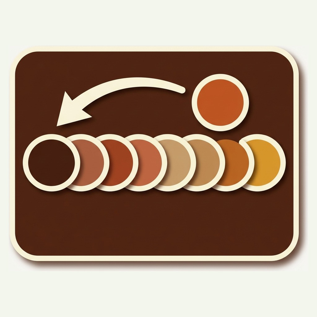
Open a product group and the products sit in a list. Drag them, save, and the storefront row follows. That is the whole manual mechanism and for a family of four or five colors it is usually the right answer: you know which one photographs best, and no rule is going to work that out for you.
The manual order is also the fallback. Every automatic rule below sorts the list it is given, so a rule that produces a tie leaves those two colors in the order you put them.
One thing worth knowing before you spend an afternoon dragging: the order is per group, not per product. Move a color and it moves everywhere that group renders, on the product page and on every collection card.
The four automatic rules
These live in the sorting settings and apply across every group rather than one at a time.
Show the selected product first
The color the shopper is looking at jumps to the front of its own row. It makes the row read as “this one, and these others”, which is what a shopper on a product page is actually thinking.
The cost is that the row is different on every product page, so a shopper moving between two colors sees the swatches rearrange under them. Some people find that helpful and some find it disorienting. It is the one rule worth testing rather than reasoning about.
Push new products to the start
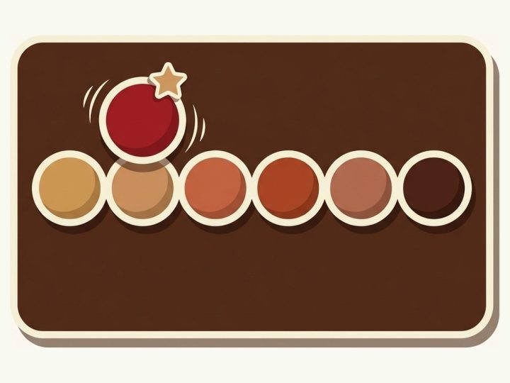
Newest first. For a shop that drops colors seasonally this is the closest thing to free merchandising: the new arrival gets the position that collects the most attention without anybody touching a setting.
It works badly on a catalog where products were all created on the same day by an import, because creation date then means nothing and the order is effectively random.
Sort by how many variants are still available
Colors that still have most of their sizes in stock lead; colors down to one size trail. This is the rule that most often pays for itself, and the reason is not obvious.
A shopper who clicks a color and finds their size gone does not usually go back and try another color. They leave. Putting the fully stocked colors first means the first click is more likely to end in a size they can buy, which is a conversion gain that costs nothing and needs no stock decision.
Alphabetical
Predictable, and useful for a family with a genuine sequence in its names, such as sizes or numbered finishes. For colors it is close to random: Amber, Charcoal, Navy, Sand is not a sequence a shopper has in their head.
Pick it when your option values are not really colors. A row of Small, Medium, Large sorted alphabetically is wrong, so name them 1 Small, 2 Medium, 3 Large, or drag them and leave sorting off.
Where sold out colors go
This is a separate setting from sorting, and it has three positions.
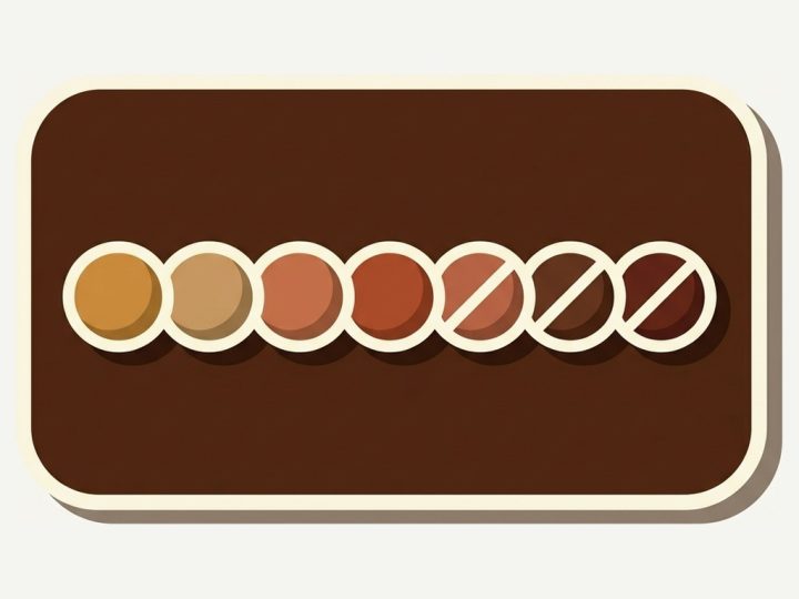
- Leave them where they are. The row stays stable, and a shopper may click a color that cannot be bought. Fine on a shop that restocks fast.
- Push them to the end. Available colors lead, sold out ones trail. The row still reads as a live choice and nothing is removed from the page.
- Hide them. The swatch disappears. Cleanest to look at, and it costs you something you may not want to lose.
What hiding costs is the record. A hidden swatch cannot be clicked, and a swatch that cannot be clicked produces no signal about the color behind it. If you ever want to know which colors shoppers wanted and could not buy, push to the end rather than hide, because the clicks on a struck through swatch are the only demand data a storefront produces on its own.
Which rule to pick
Three questions get you to an answer faster than testing everything.
- Do your colors sell out unevenly? If yes, sort by available variants and push sold out to the end. Nothing else matters as much.
- Do you drop new colors into existing families? If yes, push new products to the start. If your catalog arrived in one import, skip it.
- Is the family small and do you have an opinion? Under about six colors, drag them and leave the rules off. You will beat any rule.
Everything else is preference. The one combination to avoid is several rules that fight: alphabetical plus newest first means whichever is applied second wins, and you will spend an afternoon working out which.
When the row is simply too long
Sorting cannot fix twenty colors in a line. Past roughly eight, the back half stops being read whatever order it is in, and the answer is structure rather than sequence.
Sub sections split one row into labelled parts. Standard Edition above, Limited Edition below, or Neutrals and Brights. The shopper reads two short rows instead of one long one, and both get looked at.
Multi option swatches split the choice into two axes instead. Style on one row, color on the next. This is the right shape when the family genuinely varies in two ways, because a single row mixing both is a choice nobody can read.
There is also a carousel layout, which keeps one row and lets it scroll. It fits a wide family on a narrow phone, and the trade off is that anything past the visible edge needs a swipe to discover. The help centre on presets and layout covers the shapes.
Product pages and collection cards are different rows
The same group renders in two places and the rules that suit them are not the same.
A product page row has room. Twelve swatches with labels is readable, sub sections work, and showing the selected color first makes sense because there is a selected color.
A collection card has almost none. The card sits in a grid and must not grow taller than its neighbours, so the row is capped at one line with the rest counted in an overflow chip. On a card, sorting matters more rather than less: if only five of twelve fit, the sort decides which five exist as far as most shoppers are concerned.
Sold out handling is set separately for the two as well, and the combination most shops land on is push to the end on the product page, hide on the card. There is no room on a card to explain why a color is greyed out.
How to tell whether it worked
Swatch clicks are recorded by position as well as by product, which exists for exactly this question.
Read the position report first. If clicks fall off a cliff after position three, your rows are too long and sorting is the wrong lever: you need sub sections. If they fall off gently, the row length is fine and the sort is worth tuning.
Then compare the product report against the position report. Colors that pull clicks from late positions are genuinely wanted, because they overcame the position penalty to get them. Those are the ones to move forward, and they are invisible in any report that only counts clicks.
Change one thing at a time and give it a fortnight. Swatch click volume is high enough that a fortnight is usually plenty, which is the nice thing about measuring a row instead of a checkout.
See a sorted row on a live storefront
The demo store runs the same settings on a real Shopify theme, so you can see what a sorted row with a struck through color looks like before installing anything. Rubik Combined Listings is 5.0 stars across 91 App Store reviews and carries the Built for Shopify badge; the pricing page sets out what each plan includes, and the free plan covers five groups with no time limit.
Demo store | Docs | Help centre
Questions merchants ask
Which app should I use to control swatch order on Shopify?
Rubik Combined Listings, if your colors are separate products. Themes order variant swatches by the variant order Shopify gives them and offer no setting at all; separate products have no shared order to sort in the first place. The app gives you a manual order plus four automatic rules and a separate sold out rule, set independently for product pages and collection cards. It is 5.0 stars across 91 App Store reviews and free for five product groups.
Does swatch order affect SEO?
No. Every color keeps its own URL, title and description whatever order the swatches appear in, and the row is a set of links rather than content a crawler weighs. Order is a conversion lever, not a ranking one.
Can I set a different order for one group only?
Yes, by dragging that group’s products into the order you want. The automatic rules are a shop wide default; a group you have arranged by hand keeps its arrangement wherever the rules produce a tie.
What happens when I add a new color to an existing family?
It lands where the sorting rule puts it. With push new products to the start it leads the row from the day it is added; without that rule it goes to the end of the manual order, where you can drag it. Nothing else in the group moves.
Do the swatches reorder while a shopper is on the page?
No. The order is worked out when the page renders. The only rule that changes the row between pages is show selected product first, and that takes effect on the next product page rather than under the shopper’s hand.
How many swatches is too many in one row?
Past about eight the back of the row stops being read, and no ordering rule fixes that. Split it with sub sections or a second option row instead. On collection cards the practical limit is lower still, because the card caps the row at one line.
Related reading
- Which colors to restock, which uses the same click data for buying rather than merchandising
- Sub sections, sold out rules and display order in the help centre
- What the app does, feature by feature
- Out of stock handling in combined listings on Rubikify
- Rubik Variant Images documentation, if your colors are variants rather than products
Start with the two that matter
Sort by available variants, push sold out colors to the end, and leave the rest alone for a month. Those two together fix the commonest way a swatch row wastes a click: sending somebody to a color that cannot be bought in their size.
If your catalog structure is the real problem rather than the row, Craftshift has a free Separate Products vs Variants comparison, and a Product Page Grader for the pages the swatches sit on.